Hey, everybody!
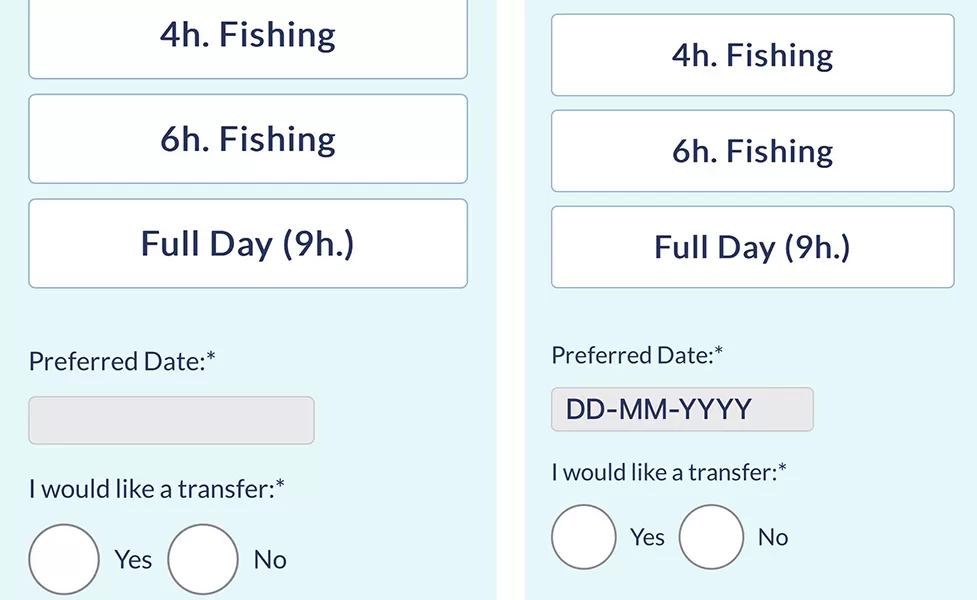
Recently, one of my clients encountered a bug in their booking form: the field for entering the date just looked grayed out, with no date format markup (DD-MM-YYYY). This caused many users to get confused and not fill out this field, which led to problems when making reservations.
Before/After:

To fix this issue and improve the user experience, I applied the following CSS code:
/*date field fix*/

@media (max-width: 767px) {

input[type="date"] {
  position: relative;
  color: transparent;
}
input[type="date"]::before {
  content: attr(placeholder);
  color: #263564;
  position: absolute;
  left: 10px;
 font-size: 22px;

}
input[type="date"]:focus::before, input[type="date"]:valid::before {
  content: '';
}
input:required:valid, body textarea:required:valid {
    color: #263564;
 background: #fff;
  font-size: 22px;
}
.booking_form p#booking_date_field {
    text-align: center;
    margin: auto;
}
.booking_form input#booking_date {
 min-width: 180px!important;
}
}
Don’t forget to change .booking_form to your form class. This code allows you to display a placeholder in the date field, making it clearer for users and making it easier to enter the date.
Always keep an eye on the usability of your website and try to solve problems promptly. User friendliness directly affects their desire to interact with your site and take targeted actions. Don’t forget to test all interface elements on different devices and screen resolutions to ensure the best user experience.


Leave a Reply